Advanced Theming
CSS-based theming enables apps to customize the colors quickly by loading a CSS file or changing a few CSS property values.
theme-color Meta
The theme-color value for a meta tag indicates a color that browsers can use to customize the display of a page or of the surrounding interface. This kind of meta tag can also accept media queries which allow developers to set the theme color for both light and dark modes.
The content value for the theme-color meta must contain a valid CSS Color and cannot contain CSS Variables.
note
The theme-color meta controls the interface theme when running in a web browser or as a PWA and has no effect when an app is deployed using Capacitor or Cordova. If you are looking to customize the area under the status bar, we recommend using the Capacitor Status Bar Plugin.
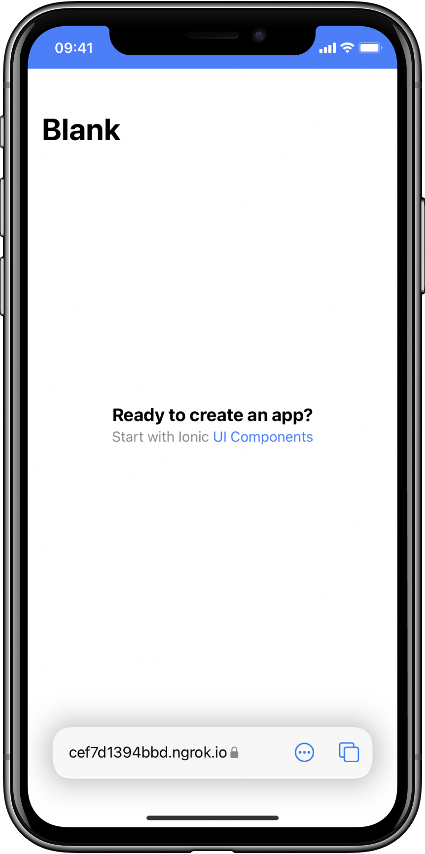
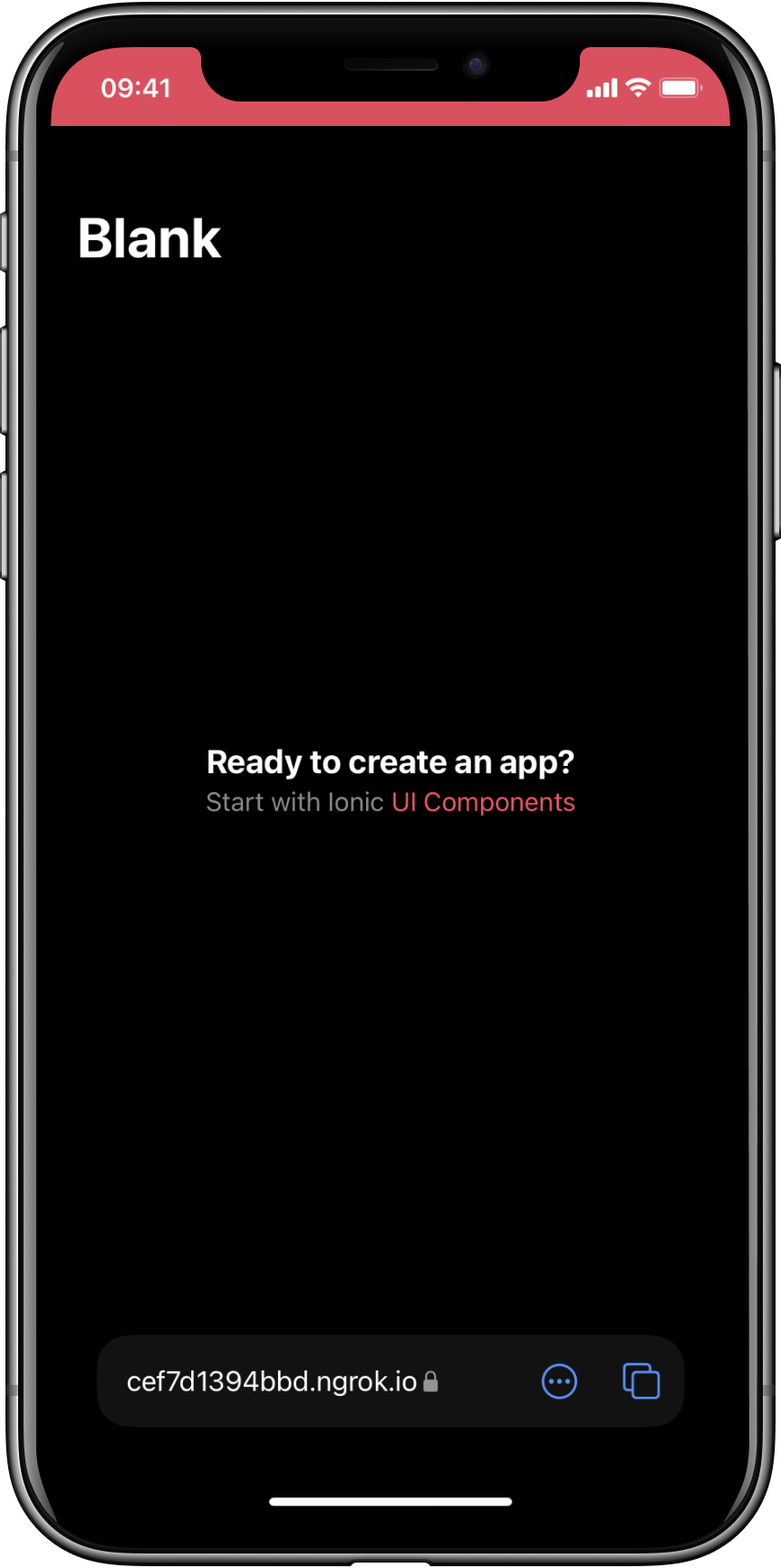
The example below demonstrates how to use theme-color to style the browser interface on iOS 15.
<meta name="theme-color" media="(prefers-color-scheme: light)" content="#3880ff" />
<meta name="theme-color" media="(prefers-color-scheme: dark)" content="#eb445a" />
| Light Mode | Dark Mode |
|---|---|
 |  |
The theme-color meta can also be used to customize the toolbar in Safari on macOS Monterey or newer.
Safari on iOS 15 and macOS will automatically determine an appropriate theme color to use, but adding this meta tag is useful if you need more control over the theme.
There is a small subset of colors that browsers will not use as they interfere with the browser interface. For example, setting content="red" will not work in Safari on macOS because that color interferes with the red close button in the toolbar. If you run into this situation, try altering your color selection slightly.
note
Browsers will prefer the theme-color meta over theme in manifest.json if both are present.
For more information, see the MDN theme-color documentation.
Global Variables
While the application and stepped variables in the themes section are useful for changing the colors of an application, often times there is a need for variables that are used in multiple components. The following variables are shared across components to change global padding settings and more.
Application Variables
| Name | Description |
|---|---|
--ion-font-family | Font family of the app |
--ion-statusbar-padding | Statusbar padding top of the app |
--ion-safe-area-top | Adjust the safe area inset top of the app |
--ion-safe-area-right | Adjust the safe area inset right of the app |
--ion-safe-area-bottom | Adjust the safe area inset bottom of the app |
--ion-safe-area-left | Adjust the safe area inset left of the app |
--ion-margin | Adjust the margin of the Margin attributes |
--ion-padding | Adjust the padding of the Padding attributes |
Grid Variables
| Name | Description |
|---|---|
--ion-grid-columns | Number of columns in the grid |
--ion-grid-padding-xs | Padding of the grid for xs breakpoints |
--ion-grid-padding-sm | Padding of the grid for sm breakpoints |
--ion-grid-padding-md | Padding of the grid for md breakpoints |
--ion-grid-padding-lg | Padding of the grid for lg breakpoints |
--ion-grid-padding-xl | Padding of the grid for xl breakpoints |
--ion-grid-column-padding-xs | Padding of the grid columns for xs breakpoints |
--ion-grid-column-padding-sm | Padding of the grid columns for sm breakpoints |
--ion-grid-column-padding-md | Padding of the grid columns for md breakpoints |
--ion-grid-column-padding-lg | Padding of the grid columns for lg breakpoints |
--ion-grid-column-padding-xl | Padding of the grid columns for xl breakpoints |
Known Limitations with Variables
The Alpha Problem
There is not yet full browser support for alpha use of a hex color. The rgba() function only accepts a value in R, G, B, A (Red, Green, Blue, Alpha) format. The following code shows examples of correct and incorrect values passed to rgba().
/* These examples use the same color: blueviolet. */
.broken {
  --violet: #8a2be2;

  /* rgba(#8a2be2, .5) */
  color: rgba(var(--violet), 0.5); /* ERROR! Doesn't support hex. */
}

.working {
  --violet-rgb: 138, 43, 226;

  /* rgba(138, 43, 226, .5) */
  color: rgba(var(--violet-rgb), 0.5); /* WORKS! */
}
note
See the CSS Variables section for more information on how to get and set CSS variables.
Ionic uses colors with an opacity (alpha) in several components. In order for this to work, those properties must be provided in RGB format. When changing any of the properties that have a variation ending in -rgb, it is important they are also provided in a comma separated format without parentheses. Below are some examples for changing text and background color.
:root {
  /* These examples use the same color: sienna. */
  --ion-text-color: #a0522d;
  --ion-text-color-rgb: 160, 82, 45;

  /* These examples use the same color: lightsteelblue. */
  --ion-background-color: #b0c4de;
  --ion-background-color-rgb: 176, 196, 222;
}
Note that the RGB formatted colors are the exact same color as the hex properties, but can now be used with rgba(). For example, --ion-text-color-rgb can now be used in the following way
body {
  color: rgba(var(--ion-text-color-rgb), 0.25);
}
Variables in Media Queries
CSS variables in media queries are not currently supported, but there are open drafts to add custom media queries and custom environment variables that would solve this problem! However, with the current state of support, the following will not work:
:root {
  --breakpoint: 600px;
}

@media (min-width: var(--breakpoint)) {
  /* Doesn't work :( */
}
Modifying CSS Color Variables
While it is possible to easily alter a color in Sass using its built-in functions, it is currently not as easy to modify colors set in CSS Variables. This can be accomplished in CSS by splitting the RGB or HSL channels and modifying each value, but it is complex and has missing functionality.
What exactly does this mean? Basically, using a CSS preprocessor, such as Sass, allows us to use functions to manipulate a single color. For example, we can create the following colors in Sass:
// Background color, shade, and tint
$background: #3880ff;
$background-shade: mix(#000, $background, 12%);
$background-tint: mix(#fff, $background, 10%);

// Text color, darker and lighter
$text: #444;
$text-darker: darken($text, 15);
$text-lighter: lighten($text, 15);
After running through the Sass compiler, the colors will have the following values:
| Variable | Value |
|---|---|
$background | #3880ff |
$background-shade | #3171e0 |
$background-tint | #4c8dff |
$text | #444444 |
$text-darker | #1e1e1e |
$text-lighter | #6a6a6a |
However, because CSS variables can be set at runtime and are more dynamic, it is not currently possible to manipulate them using a simple function.
This is normally not a problem, but when an application needs to have dynamic theming it presents issues. In Ionic, this is the reason that there are variations to each color, and it is also why stepped colors are necessary for theming.
There are drafts and issues discussing color modification proposals that would make this possible.